A Short Introduction to Linear Regression in Python

I’ve recently been deep-diving into Data Science to add further strings to my bow as a product manager. Understanding and utilising the data within your product is one of the most critical factors for success as a product manager, and as such, the more tools you can have at your disposal for that the better.
Linear regression helps you to predict a variable based on your past data, where you have 1 or more independent variables that are related to the variable you want to predict in a linear form. It attempts to draw a line through each of the data points, such that the total distance from the points to the line is as small as possible. The linear regression itself gives you the function for that line, so you can plug in values to get predictions. See the example below:

The formula for linear regression is Y = a + bX1, where Y is the variable you are targeting, the dependent variable, and X is the independent or explanatory variable.
For example, you are trying to predict house prices in a given area based on the size. Y would be the price, and X would be the size in square metres (or feet if you prefer ;)). a is the point which the line crosses the Y-axis, i.e. the value of Y when the value of X is 0. Finally, b gives you the gradient of the line.
Using past data, you can utilise libraries in Python to calculate the values of a and b, giving you a model such that you can predict the values of Y for various X values.
Pre-requisites
- First you need an environment and text editor to write and run your python code. I recommend Jupyter Notebooks with Anaconda Cloud as it sets everything up for you.
- You of course need some decent historical data in order to produce a good model, save it as a CSV file and put it in a folder so you can access it from your code.
- Ensure your variables are a good fit for Linear regression, I won’t go into it in this post, but you can read about key assumptions that should be applicable here!
Got everything up and running and ready to go? I’ll show you how simple this can be!
Import relevant libraries
Step 1 is to import the Python libraries that we’ll use in the regression. These are ready made packages of code and functions that help us to do things without writing everything from scratch. They take the majority of the complexity out of doing this sort of task!
The libraries we need are:
- Pandas: For extracting the data from the CSV and putting it into a Dataframe, making it easy to interact with in your code
- Matplotlib: For plotting data on graphs to visualise your data
- Statsmodels: For performing the regression itself
- Seaborn: For making the graphs look a little bit prettier
This sounds complicated, but it’s actually really easy, just type in the code below to import these libraries and you can use them directly. If you’re using Jupyter in Anaconda Cloud, these will probably already be installed for you, if not, you may need to type “pip install *name of the library*” in your terminal within the Python server that you’re using. You can get more help on installing packages here, though I’d suggest if you’re unfamiliar, go with the Anaconda Cloud approach first!
import pandas as pd
import matplotlib.pyplot as plt
import statsmodels.api as sm
import seaborn as sns
sns.set()
It’s actually good enough just to type “import” and then the name of the library, but it is common practice to import them in this way. Less to type later when writing your code!
The last part, sns.set(), basically asks the Seaborn library to apply its formatting to any visualisations you might later produce with Matplotlib. You can do a lot more with Seaborn, but this is a nice quick and easy way to improve the Matplotlib visualisations.
Process your data
First you need to read the CSV file and convert it to something you can interact with in your code, this you do as follows:
data = pd.read_csv('name_of_your_file.csv')
Here we are utilising a function that is built into the Pandas library to read the csv file, create a dataframe and we’re saving it into a variable called “data”. If you’ve saved your data in the same folder where you’re running your code, you just need to type in the name of the file here.
In Jupyter, after you’ve run this line of code, you could type “data” on the next line and it will show you how it looks! This is good practice so you can check out your data and see what might need to be done.
Next, we want to map our variables from the data to be used in our regression. We do this as follows:
y = data['*name of your dependent variable exactly as in the file*']
x1 = data['*name of your independent/explanatory variable exactly as in the file*']
“data” plus the square brackets, using the name of the column you want will grab the column you want and save it into its own variable. We’ve named these y and x1 (there could be multiple independent variables so this tends to be common pracitce).
In the example above with house prices based on size, y would be the “price” column and x1 would be the “size” column.
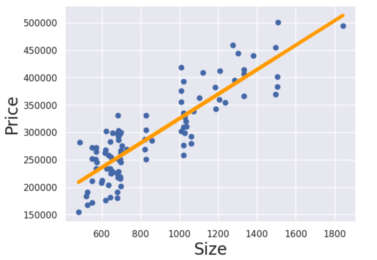
Finally, let’s plot the data before we do the regression so we can see something:
plt.scatter(x1,y)
plt.xlabel('*name of your dependent variable*', fontsize=20)
plt.ylabel('*name of your independent/explanatory variable*', fontsize=20)
plt.show()
Here, we’re using matplotlib which was imported as “plt”, which has a function called “scatter”. Unsurprisingly, this function creates a scatter graph! We’re providing our two columns as inputs and then adding labels. Finally, we show the result using show(). We’re basically just typing English right?! When you run this, you’ll see your graph in Jupyter with some Seaborn formatting already applied.
So now we can see our data, and now is a good time to reflect on the linearity of it. How much value would it add to put a line through the data? Are the variables obviously linearly related or should we be looking at using a different model? If we can confirm decent linearity, let’s continue!
Perform the regression
We perform the regression as follows:
x = sm.add_constant(x1)
results = sm.OLS(y,x).fit()
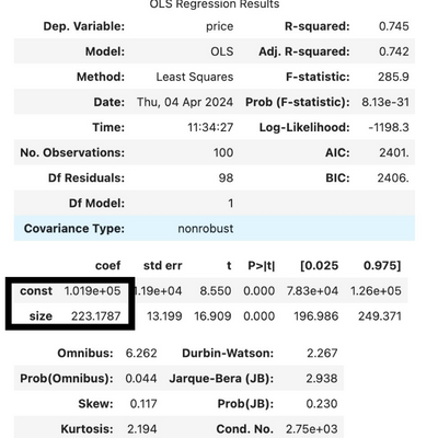
results.summary()In the first line, we are creating a new variable called x. In the formula above, there is technically an X0 which is multiplied by a, however this is always 1. Therefore, what we do here, is add a constant which is simply a column full of 1s so we have all the values we need to execute the formula.
Then, we carry out the regression. In this case we are using “Ordinary Least Squares” or OLS, which attempts to find a line with the least total distance to each of the points. The squares part is to get rid of any negative values, since it is only magnitude we’re interested in and not if the points are above or below the line.
Finally, results.summary() gives us a nice table which tells us a few key bits of information about our regression. It’s beyond the scope of this post to explain this table, but a couple of figures you can check out are:
- R-squared (or adj. R-squared if you’re using multiple variables): This will be a value between 0 and 1 and will tell you how much the independent variable explains the dependent variable you want to predict. A higher R-squared means that you can more accurately predict values with this model, a lower R-squared will mean that there are most likely additional variables you should be including in your model to get more accuracy.
- Secondly, the F-statistic is also a key value. Here you’re looking for as many 0s as possible! An F-statistic which starts with 0.000 means that your model is significant, and that it is useful to look at the relationship between these two variables.
Finally, we can plot the line we have produced on a similar scatter graph to the one we created above:
plt.scatter(x1,y)
plt.xlabel('Size', fontsize=20)
plt.ylabel('Price', fontsize=20)
yhat = [input your actual value for a] + [input your actual value for b]*x1
fig = plt.plot(x1, yhat, lw=4, c='orange', label='regression line')
plt.show()
The first part is exactly the same as above.
Then we have this complicated looking “yhat” part. “yhat” is simply what we’re calling our predicted values (it’s a “y” with a little hat on). Then we input the values that we got out of our regression model to draw the line. You will find these values under the heading “coeff”. The one named “const” is your constant “a” for the formula – remember this gives you the point which the line should intersect with the y-axis. The one named “size” in the image below will be replaced by the name of your independent variable. This will give your the steepness of the line.
Finally, we have everything we need to draw the line. By using plt.plot() we are adding this line to the graph we already created above which contains the scatter graph. We had the x1 values and the yhat formula which is the function of the line. The other parameters in this function are formatting such as “lw” which is line width, “c”, which is colour and finally the label!
Add plt.show() and you’ll see the result!
Some of the concepts might appear complicated, but with the help of the Python libraries, there aren’t many lines of code to write at all!
Most real life applications of linear regression will require using multiple independent variables, but I hope this article was useful to help you get started using Python for linear regression. I will cover adding more variables in a future article, but this is also simple to do!
Did you find this useful? Let me know and I’ll happily share more similar content!